
27 Mar Handy Guide to Making Skintones!
Just about any game with any amount of “rpg elements” will offer some character customization. Getting a good selection of skintones for humans can be a bit tricky. Nothing is worse than programmer designed sliders to pick your skincolor in a game, but figuring out a good color wheel or swatches to pick from can seem tricky (or “racist”).
I spent a couple days doing R&D on this years ago and had to dig my old work up for our new pirate action-sim Cutlass & Compass. Here’s my process for getting as many skintones as you want for your game, I’m using Photoshop but any graphics program will work. The theory could be adopted for alien races, a less naturalistic color palette, or whatever your game needs.
Two basic goals outline the process:
Goal: Try not to be racist
We were working on an RPG project and knew we wanted a color wheel players could color-pick from to get a “normal” human skin color from with all races represented. We didn’t want to offer a regular chromatic wheel (no green or blue people). There’s no way you can pick a handful of swatches and cover the bases without exaggerating or ignoring some demographic, and then you’re “racist.”
Goal: Solid value range
It was important to get really pasty and also really dark skintones.
Step 1: Base Value Gradient
Make a 512x image (or just steal this one). Use the Gradient tool and make a linear gradient top to bottom of your highest value skin to your lowest value. This layer should be almost greyscale but not quite.

Now we have a good base. We need to put a color layer on top of this. Skin basically falls into a warm or cool base
Step 2: The Subjective Color Layer
Add a layer. Use the Gradient tool, make a linear gradient from left to right of your “coolest” skin to your “warmest.” Which basically means yellow/olive to red. Do some research and pick values that work for you. This is the subjective bit where you feel “racist.”
Here are the colors I think give a nice palette without being cartoony or exaggerated.

Set this layer to Overlay mode. At this point you can stop, but I like to do one more little layer.

Step 3: Desaturation Finish
Add a layer. Use the Gradient tool, make a linear gradient from left to right. This gradient should be solid black with Location 0’s opacity at 0%, Location 50’s at 100%, and Location 100’s at 0%. Like so:
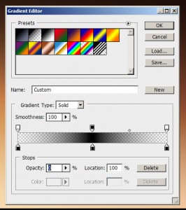
Set this layer mode to Saturation and layer opacity to 38% and you get:

At this point if you’re going to use a color-picking process in your game you’re done! Save that image out and you’re good to go. If you want swatches or distinct rgb values to cycle thru we need to do a few things.
Step 4: Swatches
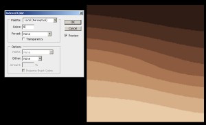
Flatten your image. Go to Image > Mode > Indexed Color. Set your Palette to Local(Perceptual). Make sure Dithering is set to None. Now set the number of swatches you want in Colors, try 8 and you’ll get some nice bands. But you’ll notice these are pretty close to our raw value gradient and don’t have much saturation.
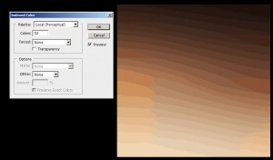
You have a couple options. Increase the color count and you’ll notice some blobs off to the sides that have more of your cool/warm range mixed in. Here’s 32 colors:
Or you can force a few colors into the range. In the Indexed Color panel choose Custom… in the Forced dropdown. Now, the whole point of this exercise was to not pick colors and then get called racist. So add the four colors that made up our two main gradients; the pale swatch, the dark swatch, the cool swatch, the warm swatch. You’ll get something like this at 8 colors:
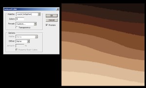
Not bad. This definitely has more color and will represent the sides of the color gradient more as as you increase the color count.
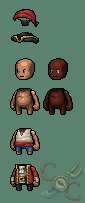
Now that you’ve got your bands you can go to Image > Mode > Color Table and see your swatches. If you have some reference you’re trying to hit save this table out and load it on top of the reference to check your swatches. Here are the 25 swatches I picked for Cutlass & Compass:

I picked 25 because the 5×5 matrix of options will look good in the menu. Here are a few assets with the skintones dropped in as Multiply layers:
There you go! You can certainly fiddle with the gradient details to get some different looks; cool/warm colors, saturation of the base, more/less desaturation, shifting to blue in the middle instead of desaturating to include the half-human half-fishmen characters in your cthulu game, etc.